Key Points
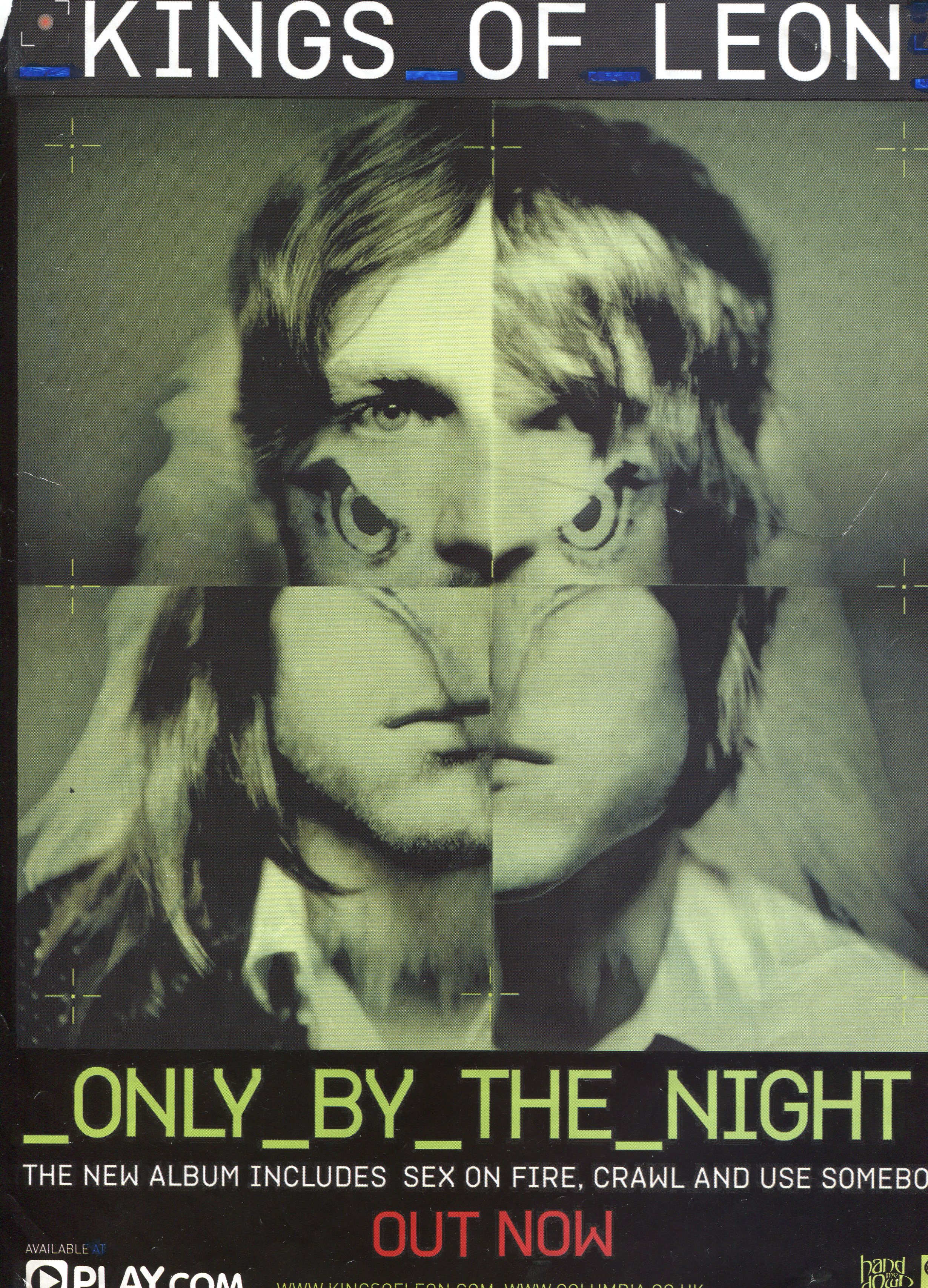
Uses images of the band members
Images split to add unique look
Mixed up familiarity
Very minimal amount of text
Artist name large+bold at top of page
Album name large at bottom of page
Major songs included in album listed
Only necessary information given
Relies on the band’s reputation greatly
Image takes almost the entire page
Limited text means instantly drawn to it
Digital colour theme, green/black
Green used on night vision, something dark
3 main colours: Green white and red

Key Points
Very large titles to grab attention
Artist Name biggest text, instant interest
Album name large, gets the point across
Image also very large for attention
Band name and image fight for attention
Information about new releases at bottom
Main information takes up about ⅖ of page
Most of page devoted to grabbing attention
Layout splits new singles from main album
Image of the album cover itself very small
Information short to get point across quickly
Fairly large font on info, easily readable
Lists most well known songs of the album
Promotional offer separate from album
Promotional offer in slightly bigger font
Singles smaller font, Album draws attention